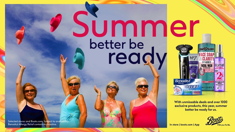


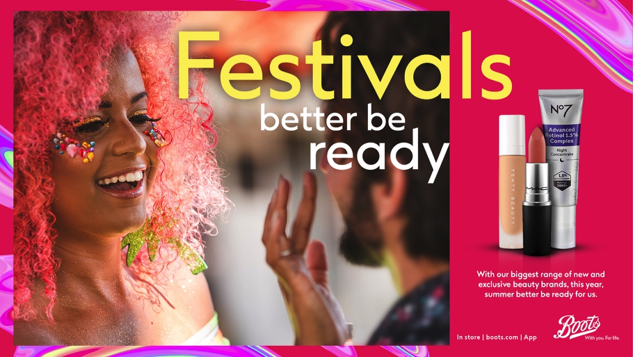

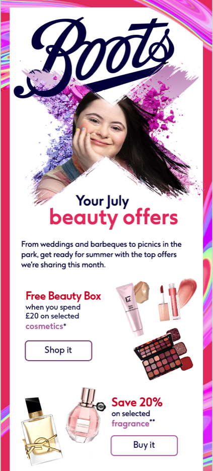




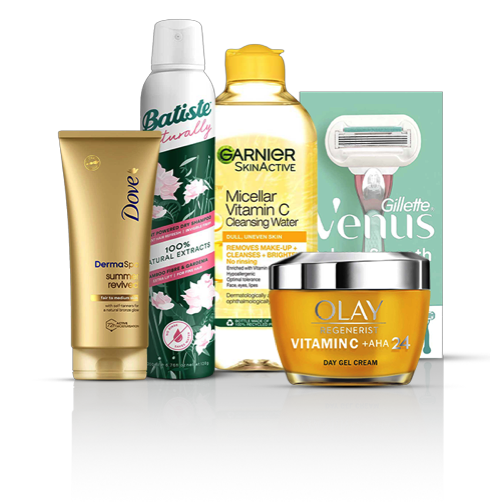



Products are position side by side with some overlap, but ensuring product branding is as visible as possible. It also has a base shadow and reflections.
*Only us highlighted colour on large text
Large text is defined as 14 point (typically 18.06px) and bold or larger, or 18 point (typically 24px) or larger.
https://webaim.org/resources/contrastchecker/
Core assets
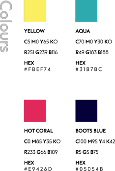
Colour Pairing
Products
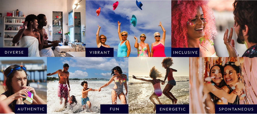
Photography
Animations
Design VI
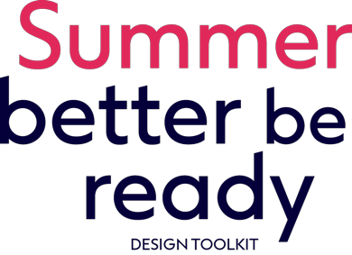
Headline lockup style
on horizontal formats
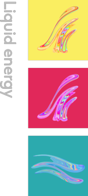
Liduid energgy
positioning on
main visual

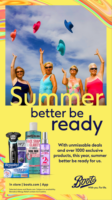
Headline lockup style
on portrait formats
Subtle dark gradient overlay to enhance headline stand out
Headline lockup style
on portrait formats
Baseline of headline
to be position at the bottom of the image box
Tinted headline slides to the right

Tinted headline slides to the right
Headline become 100% of colour
Tinted products slides from top
Products in full colour Tinted sub headline slides from right
Sub headline and products in full colour. Button appear
Tinted products slides down from top
Tinted sub headline slides from right
Icon slides
down from top

CTA slides to
the right
CTA slides to
the right
Icon and subs
full colour
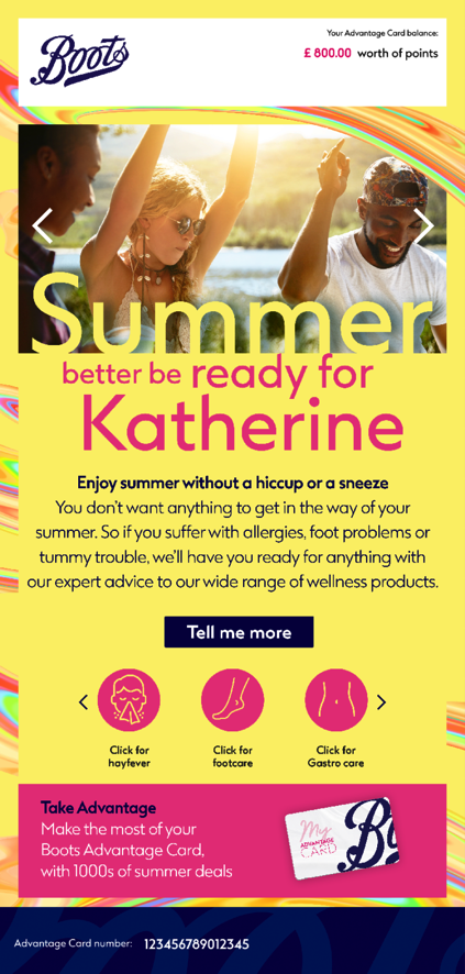
“Summer better” slides down from top while
“be ready” slides up from the bottom
“Summer better” slides down from top while “be ready” slides from the bottom
Button inverse
when rollover
T&Cs appear when rollover “Terms and Conditions”
Products in full colour Tinted sub headline slides from right
Sub headline
and products in
full colour.
+44 7816 120290 | goddang@gmail.com
Copyright © 2023 Vincent Dang - 10pt Design Ltd.- goddang.co.uk
+44 7816 120290